Tuesday, January 31, 2006
Crust Crazy!
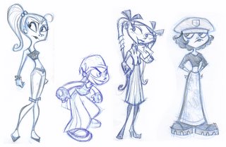
So you like Brit and Tiff? Well, there's plenty more where that came from. These great sketches by Jill Friemark suggest some slightly different stylistic directions for the series. Even the drawings that were stylistically different than what we ended up with were very useful in honing the personalities (and fashion sense) of what would eventually become two of our very favorite characters.
Monday, January 30, 2006
Brit and Tiff beginnings
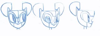
When we learned that Teenage Robot would become a tv series it was several years after the pilot was made, and Rob and I wanted to tackle the show with a new stylistic approach. Initially it was easier to find that new style through developing characters we had never seen before, so I started playing with the female bullie cousins Rob had described to me. At first I simply enjoyed playing with the visual style and costume ideas, but the suprise was watching how their personalities began to solidify (thanks to some valuable direction from Mr. Renzetti).
Friday, January 27, 2006
Who says we're original?
Here are some black and white villian portraits that were eventually painted (in color) for the "Legion of Evil" episode. We've always found it fun (and a little bit of extra work) to break the show's usual visual style to make a special story-point, or to create a dramatic effect. Some of these are homages to artists, comics, or animation of which we are fond. These still images were inspired by a scene in the classic Bob Clampett/Daffy Duck cartoon "The Great Piggy Bank Robbery" pictured below. What tributes have you recognized?
Tuesday, January 24, 2006
Seonna's "Animus"
I realized that we've yet to plug Animus, a beautiful new book written and illustrated by our own our emmy-winning lead backround painter Seonna Hong. The design,colors, and technique are all truly inspiring, the story is melancholy-sweet, and it's a pop-book to boot! You can get yours at Flopdoodle, as well as at other places.
Jenny comes of age
I thought that it might be interesting to note that Jenny's evolution didn't stop when the series began. As a design is finally put to the test by a team of artists there is usually a natural streamlining and strengthening process that happens, and sometimes it takes the model sheets a season or so to catch up. Here's a comparisson of the seasons one and two xj9's. The individual differences are subtle, but the overall effect is (hopefully) more appealing.
Monday, January 23, 2006
the birth of Jen?
Here is the sketch that Tracy (Rob's wife) identified as more appealing than the "final" results of our labor, and thus Jenny began to take her more familiar form. I had drawn this sketch, but had dismissed it early on, probably because I had felt it was less complex than some of our other concepts, and therefore less interesting. There are two valuable lessons here, both of which I've revisited and relearned many, many times in 7-8 years since;
1) In hand drawn animation, simplicity is one of your greatest allies, stripping away that which is not important is almost always more important than adding fanciness on top, and 2) It's difficult to have perspective when you're deep in the trenches.
The First Audience Member
I want to thank Alex for all the posts he's put up recently. It's been fun for me to review these long buried images. Some one asked why the first 'final' Jenny was scrapped. It's simple. My wife hated the design. She's is the first audience member for most of what I do and one of the few non-artists in my daily life. Also I like her a little bit and tend to value her opinion. I don't necessarliy always agree (she liked the pilot Wakeman better than the series Wakeman) but she reacted so strongly about Jenny that it made us reconsider our decision. You'll notice that the body stayed the same but we ended up swapping in a different head that we all really liked. Again my wife pushed for that head design. Years later she would actaully help create an episode by writing the outline for "Around the World in 80 pieces".
Saturday, January 21, 2006
The Jenny that never was
After attempting many, many different takes on the robot girl character, Rob and I finally narrowed them down and agreed on a final direction for the design, and preparations were made to start story-boarding. Here is that final jenny design.
Luckily it didn't take us long to realize that we were wrong.
Thursday, January 19, 2006
pre-prehistoric Jenny
Wednesday, January 18, 2006
pre-historic Jenny and pals
My art-director days are numbered here on mlaatr. Before they boot me out completely I thought that it would be a neat idea to start posting some of our more interesting production and development artwork from our archives before it all gets packed up. Enjoy!
Here's our four leads as they appeared in the pilot "My Neighbor is a Teenage Robot". Check out the Jenny with shoulder pads, beak-like lips, and- a square belly button?
Tuesday, January 17, 2006
My Life as a Teenage Wakeman?
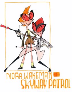
Greetings! While in retrospect 39 half-hours and 73 individual stories (I think) seems like quite an accomplishment, we had hoped to continue simply because we had more stories to tell. While there's still a few suprises in store in the tail-end of season three, there are a few sagas that will never be seen. Such as this one: Jenny was to travel back in time to fight side by side with her mother, a teen-aged rookie member of the Skyway Patrol. Alas, so much of Nora's mysterious history will forever remain locked away inside Renzetti's glossy dome.
Tuesday, January 10, 2006
Visit the Frederator blog!
Fred Seibert, the grandfather of TR and all other Oh Yeah Cartoons, has a wonderful and wide ranging blog which covers a host of cartoon related topics. Many of the next batch of Oh Yeah Cartoon creators blog over there and Fred himself posts on a much more regular basis than yours truly. Recently he's been posting Teenage Robot title cards for THIRD Season. Consider it your first sneak peek.
http://newtoons.frederator.com/post/635
Subscribe to:
Posts (Atom)