Wednesday, March 29, 2006

Cluster Prime time


This week various alumni from Teenage Robot will be submitting work to be considered for Emmy nomination. There was only one episode eligible for submission this time around, and happily it's "Escape from Cluster Prime", one of my very favorites. Our crew has always worked very hard to put the "special" into a special, and as our longest episode, this was no exception. We had discussed the idea of Jenny on a robot planet almost from the very beginning, and Just to make sure it would truly capture the imagination, our design crew was sequestered to conference room several days for visual development and group brainstorming sessions, something extremely rare within a hectic tv production schedule.


I loved conceiving my first ever "movie-title" sequence. Rob actually had to fight a few battles to get front-end credit for nearly the whole crew, who were surprised by the results at the premiere screening.

This sequence was meant to evoke Disney's world-war II era propaganda films. Kudos to Bryan for winning the most disturbing Jenny contest.

Friday, March 24, 2006

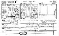
Real live storyboards!

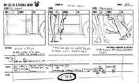
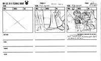
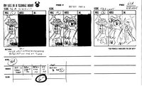
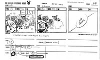
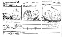
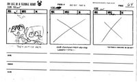
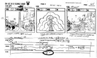
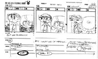
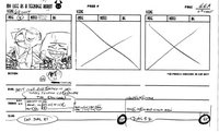
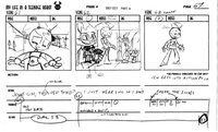
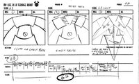
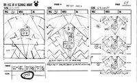
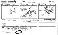
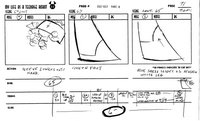
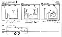
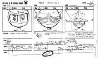
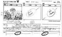
I thought that there might be some out there curious to see what an entire storyboarded sequence looks like before it's sent to Korea to be animated. Then again, I've been wrong before. The production of "Victim of Fashion" fell between seasons one and two, and we were able to spend a little extra time with it (as a result, it expanded into a half hour special). This was especially exciting to me, because it meant that I'd get to do some storyboarding on the show myself (this happens very rarely), collaborating with Brandon Kruse. Here's one of my favorite sequences I got to work on.


Thursday, March 23, 2006

Background information

Last month on the blog we gave a well-deserved plug to the vivid color stylings by Seonna for the show's backgrounds, But it's definitely worth pointing out that much work goes into these settings well before the paint-tubes are even opened. Joseph Holt and Chris Tsirgiotis were the uber-talented scribblers responsible for most of the BG layouts on the show. Their drawings always struck the delicate balance of being functional, accommodating the actions of the characters as determined in the storyboard, and of reinforcing the highly stylized feel of the series. With clever cheats of perspective (or lack thereof), whimsical background signage, heaping doses of fanciful deco-era architecture and endlessly inventive shapes and patterns, every background was worked towards creating a believable and entertaining world for our characters to inhabit.
"Around the world in Eighty Pieces" was a great opportunity for the BG boys to stretch the "future-deco" look beyond the bounds of Tremorton and reshape the world according to their whims.


Friday, March 17, 2006

Argh!

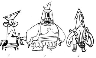
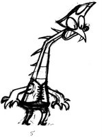
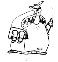
Speaking of creepy characters, here's a gruesome gang of ruthless space pirates created by Bryan Arnett for "Good Old Sheldon". Bryan was always great at (and a good sport about) designing very imaginative extraterrestrial, robots, and mutant bikers in large quantities and in over a very short period of time so that the board artists could populate the backgrounds of their panels. The critters never seem to get much individual screen time so I thought it would be nice to give them a moment in the spotlight here.

Wednesday, March 15, 2006

The Unofficial Halloween Episode


One of my biggest regrets about the end of TR is that we never got to do a Halloween Episode. It is easily the favorite holiday of both Alex and myself as you can probably tell by past posts about our decorations. Unintentionally we did two kind of creepy episodes towards the end of our run and, as luck and scheduling would have it, they ended up in the same half hour. One is about zombie robots of historical figures. (Don't ask.) The other features a evil ventriloguist dummy and his army of puppets. I've always loved evil puppet stories and am quite pleased with the twist we put on this genre.

Friday, March 10, 2006

That's the old spirit!

Here's an apparition that never had the chance to materialize in Tremorton. According to the original series bible, "the Polterguest" was to be the one kid more desperate for teenage friendship than Jenny. However, at the time Rob pitched the character, the network felt the idea tread to far into "Danny Phantom" territory. As you can see, we didn't even get the chance to decide on a gender for the character.


I mourn this lost soul for a couple of reasons; a phantom flapper would have been a great way to extend the 1930's theme into the show, and a supernatural character would have been a great way to expand mlaatr's world beyond the science fiction genre. Too bad she hadn't a gost of a chance.

Tuesday, March 07, 2006

Biker Makeover


Here are some more humble beginnings for characters who later became staples of the series. The space bikers (or "Orion's Angels" as the series pitch bible refers to them) Letta, Lenny, Olga, Sludge and Tammy, found their personalities very fast, but their designs were a little clunky in "Return of the Raggedy Android".In "Victim of Fashion" we finally had the chance to give them the tune-up they deserved. The trick was not just streamlining them, but choosing one aspect of each to emphasize (Olga for instance didn't look right with a big head and a big belly, so she just became a giant head). This is of course with one exception. Tammy, we've always loved you just the way you are!

Saturday, March 04, 2006

Dawn of the xj's

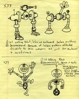
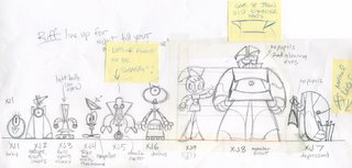
First season scribe Mike Bell was the one to first ponder what came before nine in the XJ series, and drew up these sketches forming a logical (and goofy) progression of robotic development.

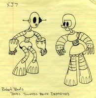
Storyboard artist Mary Hanley created these designs for the first draft of "Sibling Tsunami", the sisters' first appearance.


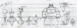
A size comp of the final designs.