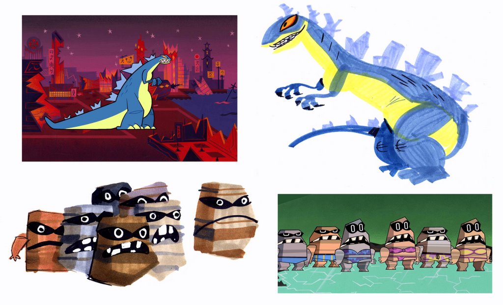
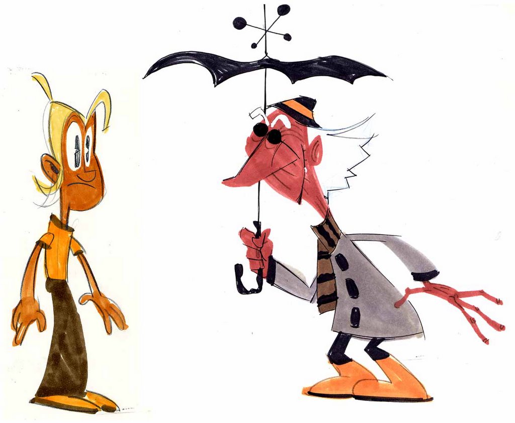
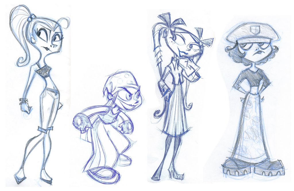
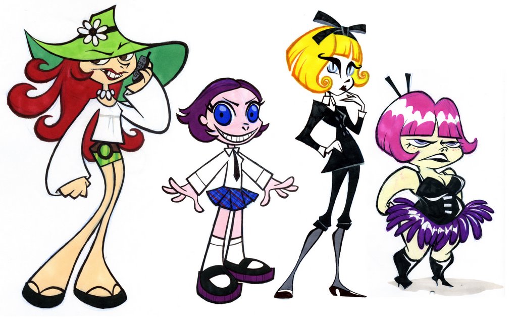
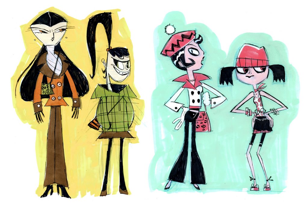
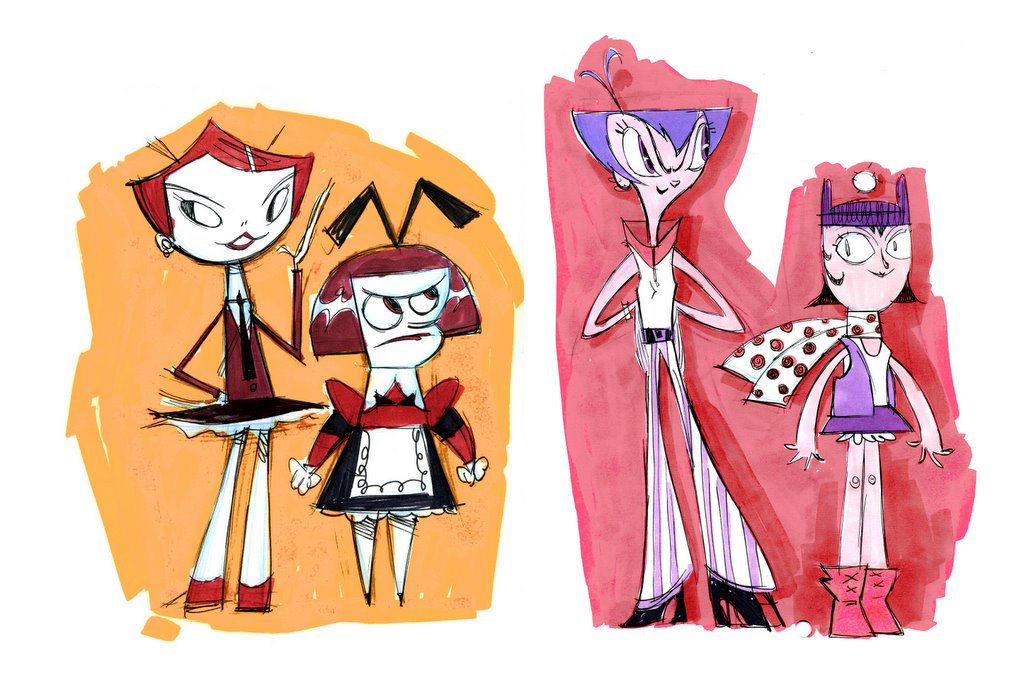
Here are some miscellaneous marker comps, all of them designs I had trouble "seeing" until I sketched them in color.

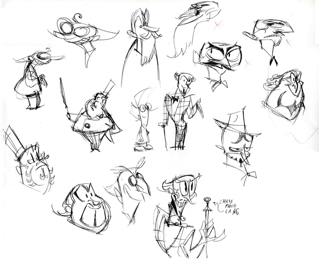 At first I start doodling faces, trying lots of different ideas. Here I work fast, spontaneity helps provide surprising results I wouldn't arrive at otherwise.
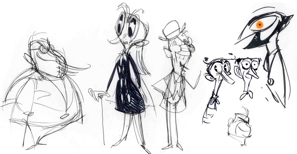 I avoid narrowing in on a particular direction for a little while. I'll show all these options to Rob and he'll help give me some focus.
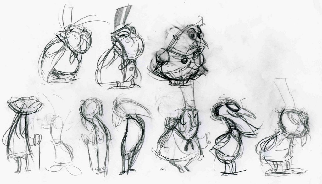 Here I'm beginning to consider his silhouette, and deciding which body type and shapes form the most pleasing contrast when compared to Wakeman. I'm also deciding what kind of cartoon animal he should resemble.
 Nearly there, the final will be a combo of these two.
 Color always helps me find the final design. It shows me the amount of detail actually required in the line-drawing,how many shapes it needs to be broken into. It also really fleshes out the personality (violet skin? Now that's evil!).
 Here's the final pencil rough, ready for clean up. As you can see, we decided an owl-man seemed to have the most humorous/creepy effect.

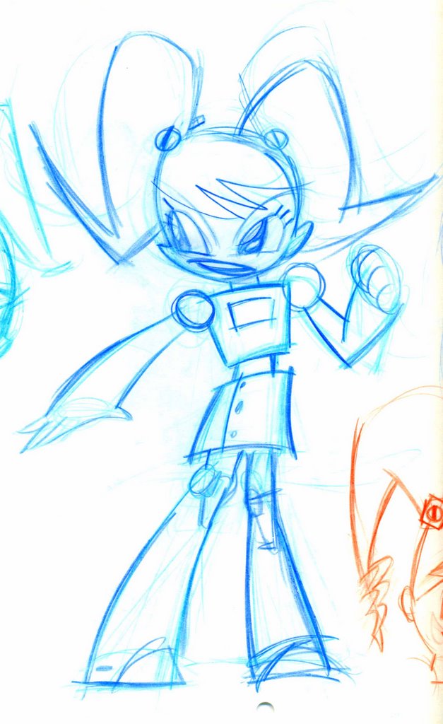
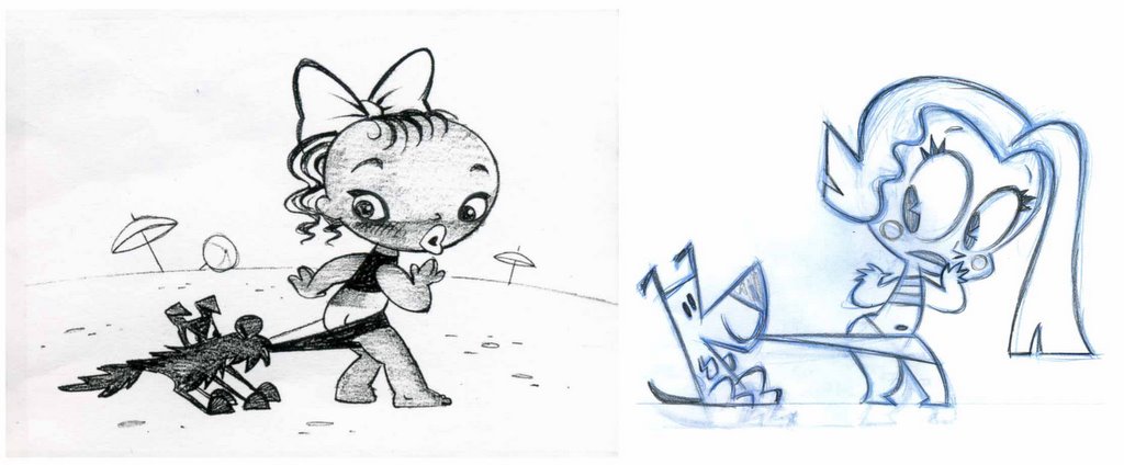
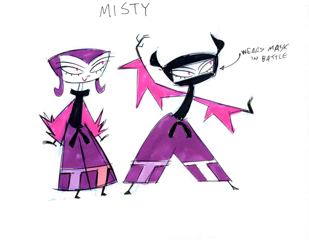 When Scott Peterson's first spec outline for us included a teenage, female space-ninja, I knew he was a good fit for the show. However, I started to re-think that decision when he had the audacity to point out to me that my first misty design (above) looked a little similar to Tiff. Oh, I suppose he had a point.




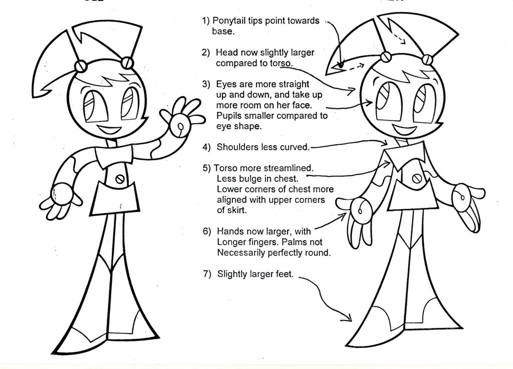 I thought that it might be interesting to note that Jenny's evolution didn't stop when the series began. As a design is finally put to the test by a team of artists there is usually a natural streamlining and strengthening process that happens, and sometimes it takes the model sheets a season or so to catch up. Here's a comparisson of the seasons one and two xj9's. The individual differences are subtle, but the overall effect is (hopefully) more appealing.