I thought I might give a glimpse of how involving the design process can be, even for a one shot character. While technically would-be Wakeman boyfriend Marty Rossians was not a villain, he needed to visually give the impression that he was one.

At first I start doodling faces, trying lots of different ideas. Here I work fast, spontaneity helps provide surprising results I wouldn't arrive at otherwise.
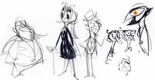
I avoid narrowing in on a particular direction for a little while. I'll show all these options to Rob and he'll help give me some focus.
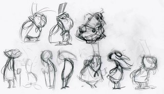
Here I'm beginning to consider his silhouette, and deciding which body type and shapes form the most pleasing contrast when compared to Wakeman. I'm also deciding what kind of cartoon animal he should resemble.
Nearly there, the final will be a combo of these two.
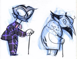
Color always helps me find the final design. It shows me the amount of detail actually required in the line-drawing,how many shapes it needs to be broken into. It also really fleshes out the personality (violet skin? Now that's evil!).
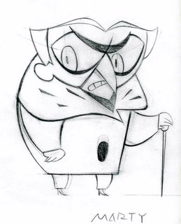
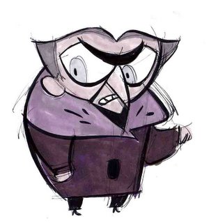
Here's the final pencil rough, ready for clean up. As you can see, we decided an owl-man seemed to have the most humorous/creepy effect.
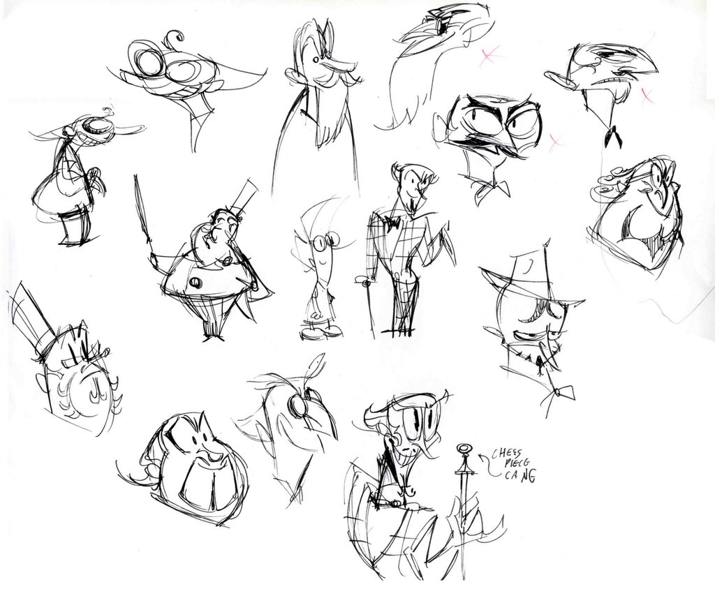 At first I start doodling faces, trying lots of different ideas. Here I work fast, spontaneity helps provide surprising results I wouldn't arrive at otherwise.
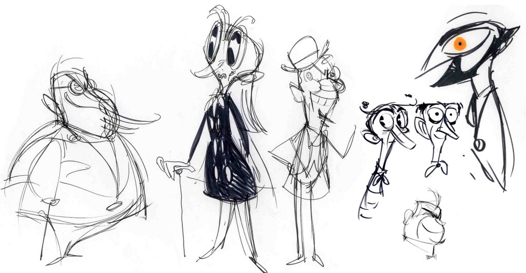 I avoid narrowing in on a particular direction for a little while. I'll show all these options to Rob and he'll help give me some focus.
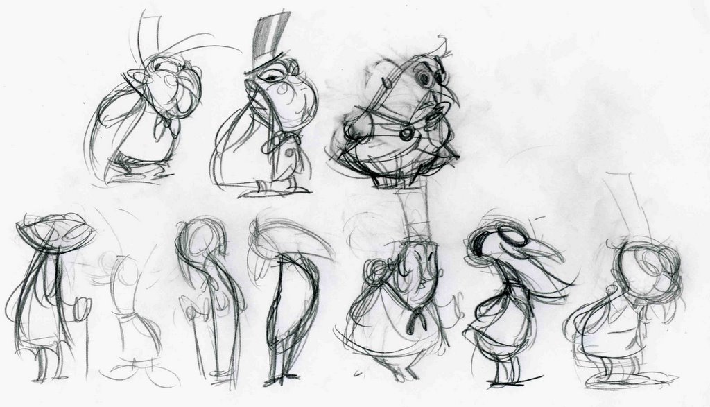 Here I'm beginning to consider his silhouette, and deciding which body type and shapes form the most pleasing contrast when compared to Wakeman. I'm also deciding what kind of cartoon animal he should resemble.
 Nearly there, the final will be a combo of these two.
 Color always helps me find the final design. It shows me the amount of detail actually required in the line-drawing,how many shapes it needs to be broken into. It also really fleshes out the personality (violet skin? Now that's evil!).
 Here's the final pencil rough, ready for clean up. As you can see, we decided an owl-man seemed to have the most humorous/creepy effect.

6 comments:
Alex:
I see that the creative process is quite intensive, as it is for any artistic design. (I design custom furniture so I have some idea of sketches amd mods).
You have a very good sense of strong Graphic presentation so that characters are Bold visually, which goves the VA more to work with, and the audience more to examine and identify with.
I read before that Jenny's face was designed for Graphic appeal, and I can see that she stands out from other "robotic" characters in the show in a pronounced way that makes her more 'human" and likeable, as many people fear robotic creations. Some feel they are inherently evil. (too many late night 50's horror flicks)
Others see them larger than life but impersonal(japanese anime)
Your show combines the best of both worlds making Jenny an all too "neither fish nor fowl" heroine.
If Nick does not see the wonderful precision that goes into this show, I am hoping that my suggestion that they sell the rights to WB or Cartoon Network or even Disney falls on the right ears.
Simply amazing character design!
The first Marty sheet you present left me in totally awe for the quantity and variety of faces and personalities you can express o.o
And the process you follow to narrow it to one design is simply breathtaking... I never imagined you placed so much effort and conscience to characters in the show :)
Personally my fave animal is the owl, so, I think Marty has just become one of my fave characters ^_^
I have to agree with the great one in two things; the first one is that you have a strong sense of graphic representation, you have a very unique style and concepts that I'm quite sure will get you where you want :D
And secondly, the idea of selling the rights of Mlaatr to WB is not a bad idea ;)
Oh, thanks again for showing us more of the preproduction work :) please keep posting more of it ^O^
Sincerely - J.R.
This is the first time I can see the character design process (very interesting!!!)
btw, how much time will take a simple-character design?
and
could you upload more photos from the korean studios?
pd: please update the mlaatr webpage link list.
See ya!
wichobot - www.teenagerobot.tk
That is really cool! Thanks for sharing the creative process with us!
I saw the episode with this fellow in, and found it delightful. Especially his laugh! I joined in with him, no less.
Post a Comment