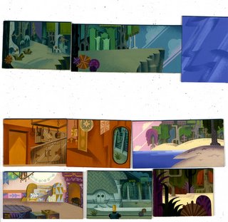
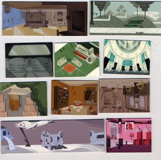
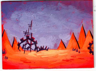
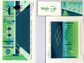
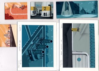
Occasionally I will do marker color comps to show Seonna for the color script (I can't whip out a gorgeous painting quite as efficiently as she does). I will usually do this when I have a particular idea about how the characters should relate to the backgrounds (the character color models aren't created until the backgrounds have already been painted). "Mind over Matter" was an especially challenging episode to find a color-arc for, the entire story was supposed to take place in the dark!
Note the Jenny fountain in the lower right where we changed our minds about her color. One important rule for coloring characters is that they should always pop off the background (this was especially truein this scene).
Friday, February 24, 2006
Thursday, February 23, 2006
Color-scripting
One gripe I have with some of the animated shows I see, is that too often each episode looks as though it has rolled off an assembly line. It's easy to see why once you've experienced the incredible deadlines and pressure to simply "get it done", but I've always felt that one of my duties as an art director was to make sure every story felt special, that each episode was easily discernable from another. Early on, Rob and I knew we wanted a show full of expressive color, that it would be the story that would dictate the sheme sof each episode, but this would require much work and planning.
These are some of Seonna Hong's "color scripts". We'll descibe the story to Seonna, then she'll create these rough color sketches of the key background drawings.Lined up, they'll start to give a sense of the emotional highs and lows of the narrative.
These are all tiny, about the size of a match-book.Once we are satisfied with the flow of things, the paint team will paint these and additional layouts slightly larger.
It is worth noting that Teenage Robot is one of the very last shows at Nickelodeon to have hand painted backgrounds.
Wednesday, February 22, 2006
Meet the crew
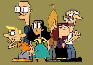
So as I mentioned previously, I've managed to keep my plate pretty full until almost the very end. For the last episode Rob proposed to me a daunting but ultimately irresistible challenge: that in one scene we include the whole crew as background characters. It took a few days of experimenting, quizzing co-workers ("now wait, who's that supposed to be?"), composing, and completing, but they're finally finished. Thanks to Shawn for the clean-up and Leticia for the color on these.
So, if you were curious about the faces behind the show (or at least the goofy cartoon versions of those faces), here is the entire in-house third season los angeles studios production crew of teenage robot.Left to right: Alex Kirwan (art-director)(me), Rob Renzetti (show creator), Ani Cash (production manager), Chris Hacker (color stylist), Jill Friemark (character designer), Bernie Petterson (storyboard artist).
A. Goose, Nick fait (production coordinator), Randy Myers (animation director), Bryan Arnett (character designer), Chris Near (background painter), Sunil Hall (prop designer), Seonna Hong (lead background painter), Charlie Desrochers (production coordinator), Tigerlily Biskup (show mascot), Robert Lacko (model clean-up).
Janice Tolentino (storyboard revisionist), Dana Jo Granger (model clean up), Debby Hindman (line producer), Scott Peterson (story editor), John Fountain (storyboard artist), Dave Cunningham (storyboard revisionist), Eric Bryan (prop designer), Bari Greenberg (background painter).
Brandon Kruse (Storyboard artist), Amy Lamprey (production assistant), Kimberley Mooney (production assistant).
Shawn Holt (model clean up), Joseph Holt (background layout), Heather Martinez (storyboard artist), Chris Tsirgiotis (background layout), Sean Edberg (prop design), Jenny Gase-Baker (background painter), Leticia Lacy (color stylist).
So, if you were curious about the faces behind the show (or at least the goofy cartoon versions of those faces), here is the entire in-house third season los angeles studios production crew of teenage robot.Left to right: Alex Kirwan (art-director)(me), Rob Renzetti (show creator), Ani Cash (production manager), Chris Hacker (color stylist), Jill Friemark (character designer), Bernie Petterson (storyboard artist).
A. Goose, Nick fait (production coordinator), Randy Myers (animation director), Bryan Arnett (character designer), Chris Near (background painter), Sunil Hall (prop designer), Seonna Hong (lead background painter), Charlie Desrochers (production coordinator), Tigerlily Biskup (show mascot), Robert Lacko (model clean-up).
Janice Tolentino (storyboard revisionist), Dana Jo Granger (model clean up), Debby Hindman (line producer), Scott Peterson (story editor), John Fountain (storyboard artist), Dave Cunningham (storyboard revisionist), Eric Bryan (prop designer), Bari Greenberg (background painter).
Brandon Kruse (Storyboard artist), Amy Lamprey (production assistant), Kimberley Mooney (production assistant).
Shawn Holt (model clean up), Joseph Holt (background layout), Heather Martinez (storyboard artist), Chris Tsirgiotis (background layout), Sean Edberg (prop design), Jenny Gase-Baker (background painter), Leticia Lacy (color stylist).
Tuesday, February 21, 2006
The final days
On a personal note, this is my very last week as part of the in_house crew on Teenage Robot (and a short week at that). The work load and schedule have remained persistently hectic right up to the very end, so I've barely allowed the meaning of this ending to set in, but it has gotten pretty quiet around here lately, and it's hard for that alone not to make me feel a little sad. But for right now I'll concentrate on the tasks at hand, updating the blog (I hope to keep going for a little while), finishing up the last few re-take sketches, and packing up all these freakin toys.
Sunday, February 19, 2006
Knight of the woodpecker
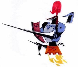
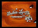
One of the stranger classic animation references in the show can be found in the design of second-string villian "the Lancer". He was created to bear a (very) slight resemblence to a certain cartoon woodpecker, a woodpecker created by Walter Lantz. Now that's about as obscure as a visual pun can get.
Saturday, February 18, 2006
Lonely hearts club gang
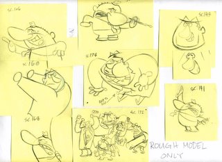
I've learned from experience that characters who will appear as a group should be designed as a group, a certain dynamic needs to be built right in from the begining. You'll note that even though all these characters have a similar attitude (sad), they each have a unique heighth and shape, and no individual is distractingly more detailed than the others. This way the group reads quickly as a unit, instead of a chaotic mass of individuals. Hopefully.
These special pose sketches give the animators more information about how to use the designs.
Friday, February 17, 2006
The Wakeman periodicals
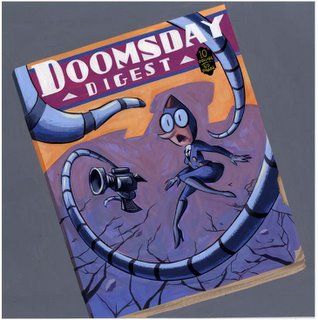
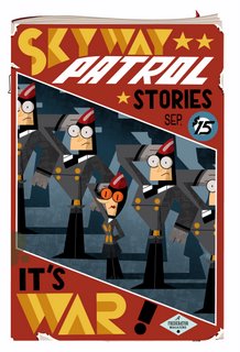
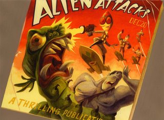
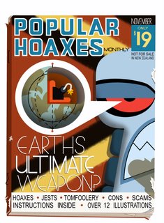
In the "armageddroid" episode we wanted to stylishly reveal some of wakeman's back-story, but we wanted to do it in a way we hadn't seen done in a cartoon before. Rob and I love old sci-fi pulp magazine covers, so this seemed as appropriate a place to pay tribute as any. A simple enough idea that turned out to be one of the most labor intensive and time consuming undertakings of the entire series. Too many artists contributed to these images to list them all here, but the results were beautiful and I remain very proud of the sequence. I'll try to get the rest up soon.
Thursday, February 16, 2006
Reference of preference
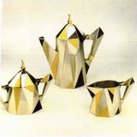
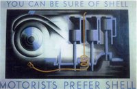
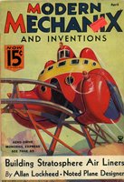
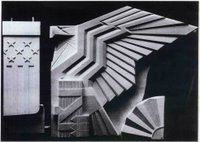
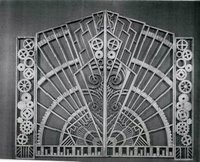
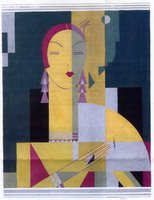
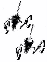
Finding a style for a show is kind of like building a vocabulary of shapes and patterns. This vocabulary needs to be versatile enough to be expressive and surprising, but ultimately everything just needs to just "feel right". Kudos to those who picked up that art deco was our stylistic starting point for the show. Here are just a few selections from Sunil's files to show some of the inspiration for our universe.
Wednesday, February 15, 2006
More proper props
Sunday, February 12, 2006
Giving props where they're due
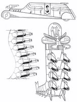
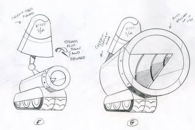
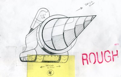
I wanted to start giving some deserved attention to our amazing prop designers, who are some of the most skilled artists I've worked with. In first season most of Jenny's transformations were handled by myself and the character department, but soon the demands of these machinations became too great for us, and the responsibilities were inherited by the prop gang. I offer here an example of a storyboard page and the final transformation design so that you can see how the prop artist approaches the challenge with the amount of information he has, and how he makes getting to the end result as fun as the result itself.
You'll note that the board artist has written "sorry Sunil" under one panel. Sunil is the prop artist who tends to get stuck with the trickiest assignments.
Subscribe to:
Posts (Atom)